In no particular order, here are four TED talks I keep getting back to, which makes me think they are my four favourites.
Monthly Archives: November 2012
Maximizing depth buffer range and precision
Half of the available range is packed into tiny distance from the near plane to twice the near plane distance.
This quote from this article of the Outerra blog is more or less its punch line. The author explains the precision issues with typical depth buffer use, and explores ways to get better results. Since Outerra is a planet engine, no wonder depth precision must be critical.
I discovered Outerra and its blog fairly recently, through a couple of mentions in the Flipcode’s Daily Flip, and was impressed by its rendering. The amount of work that went into it must be insane. See these captures demonstrating the space to ground transition or the grass rendering for instance:
Triangle order optimization
This article by Adrian Stone discusses the impacts of triangle ordering in meshes and compares some algorithms.
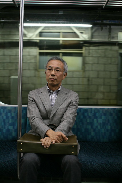
Portrait of a stranger
Attending a photo exhibition on Sunday motivated me to take my camera with me again. Not to go out and shoot, rather just in case, for those “would make a nice photo” moments.
While commuting back from work in a half empty train on Monday, there was such a moment. This man sat in front of me and soon he tried to sleep. But although his eyes were closed, I could see he wasn’t sleeping (unlike so many Japanese commuters who just instantly fall asleep, often in the middle of checking their mails). His face looked calm and unworried. With the empty seats, I thought it would make a good image as soon as some motion through the window would contrast with his quiet looking.
But before that moment came, another commuter sat next to him. I spent a while wondering if I just missed the shot or if I should take both of them anyway. I liked his face and kept staring at him, after he gave up on sleeping, waiting for an eye contact so I could take his portrait.
That moment didn’t come either. Finally I took my camera and aimed anyway. After a few seconds, I pressed the button.
He looked at me, and smiled.
(The photo is as-is, out of the camera, without any post-treatment of any kind.)
Tour of the International Space Station
From the video description: “In her final days as Commander of the International Space Station, Sunita Williams of NASA recorded an extensive tour of the orbital laboratory […]. The tour includes scenes of each of the station’s modules and research facilities with a running narrative by Williams of the work that has taken place and which is ongoing aboard the orbital outpost.”
Making the subtle obvious
Take a video, decompose it into several frequency components, filter and amplify each one, recompose them back to an output video, profit. Nuit-Blanche mentioned this paper presented earlier this year at SIGGRAPH. I never thought you could actually detect the blood flow from a simple video…
Update: more to see in this follow-up post.
Article on the color mixing tool of Paper for iPad
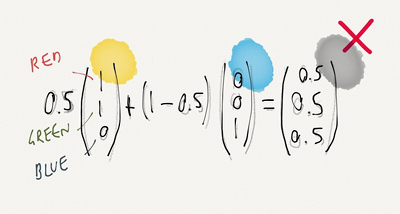
Paper is a drawing application made by FiftyThree for the iPad, that has earned some attention. FastCompany has a story on what seems to be the central tool of Paper: The Magical Tech Behind Paper For iPad’s Color-Mixing Perfection.
The article follows the authors on their thought process, from the starting observation that linear interpolation in RGB space leads to unpleasing results, to experiments and eventually, the final tool.
(Illustration with the kind permission from Chris Dannen)


