Article on the color mixing tool of Paper for iPad

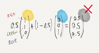
Paper is a drawing application made by FiftyThree for the iPad, that has earned some attention. FastCompany has a story on what seems to be the central tool of Paper: The Magical Tech Behind Paper For iPad’s Color-Mixing Perfection.

The article follows the authors on their thought process, from the starting observation that linear interpolation in RGB space leads to unpleasing results, to experiments and eventually, the final tool.

Illustration from the article

(Illustration with the kind permission from Chris Dannen)


Reading list on skin rendering

Skin rendering is really not my thing. Yet. I have too much figuring out rendering of opaque materials already to deal with ones exhibiting sub-surface scattering. But I got trapped reading one article and then another.. and before I knew I had a list I wanted to note for later reference.

Many links missing, as I’m not done checking the major techniques mentioned in the presentations, but perfect is the enemy of good after all.

Two cute dogs

Anyhow–whatever the reason for my animosity–I saw this couple, hated them and flashed at them. Three times. Each one capturing a slightly more shocked expression. It was my intention. I wanted people like this to be outed in some way–I found it appropriate to shoot them in the same way as a paparazzi would.

So goes a recent interview of Charlie Kirk, British photographer going by the handle Two Cute Dogs.

Although now living in UK, Charlie had been in Tokyo for many years and doing street photography. That’s about all I know about him, the rest is guess. A strongly opinionated person I’d dare to assume.

I can only recommend you to have a look at his work (on Burn My Eyeon Tumblr, not on Flickr anymore; note it can be NSFW). His style is remarkable, using flash to take street portraits in an intrusive, aggressive manner. Some of his shots are truly fascinating. In the interview, he explains how he took what would become his single most famous shot.

The point of this post was only to mention that interview, but while I’m at it, here is a documentary by Adrian Storey. There’s even a TL;DR version, ahem, trailer.

At last underneath his portrait of Charlie Kirk, Jason Comb also writes:

Everywhere and especially in Tokyo people put on a mask of sorts to project an image of how they want people to see them. Charlie’s work is as if he pulls off that mask, then captures what’s under that mask to reveal something more interesting. Of course this isn’t for everyone and some people don’t like it, but in a sea of mediocrity and many relying on post production to make their photos interesting Charlie is a breath of fresh air.

Series of articles on anti-aliasing

Matt Pettineo is writing an interesting and in-depth series of articles on anti-aliasing:

In this last article, he provides a list of captures comparing the results he obtained, as well as the source code.

On a side note, I like this short post of Timothy Lottes (well known for FXAA and TXAA) where he compares typical film image with typical video game one. His example of temporal aliasing is also worth keeping in mind.

Embrace Life

After mentioning it during lunch, I realized I never posted this here: Embrace Life is the name of a brilliant short, written and directed by director Daniel Cox and produced by Sarah Alexander, for a British safety campaign back in 2010. Far from the usual shocking images, it chooses to convey its message through a metaphor and yet manages to deeply move the audience. The film uses slow motion, which was made possible by shooting with a Phantom HD camera.

“I wanted to create a visual metaphor addressing how a single decision in a person’s day can greatly influence both their own and their loved ones’ lives. Choosing to film the story inside the family living room represents the feelings many people equate with their own car, in that it represents a level of safety and protection from the ‘outer’ world. So to create the emotion of this dramatic moment, I wanted to tell the story using slow motion to allow the audience the time to be drawn into the film’s world and to let them connect with and project their own feelings onto the scenario playing out before them. I wanted to give the audience the time to breathe, to absorb our message and using slow motion was the right technique to allow this to happen.” (Daniel Cox)

Unfortunately I have never found a HD version of it.