Two cute dogs

Anyhow–whatever the reason for my animosity–I saw this couple, hated them and flashed at them. Three times. Each one capturing a slightly more shocked expression. It was my intention. I wanted people like this to be outed in some way–I found it appropriate to shoot them in the same way as a paparazzi would.

So goes a recent interview of Charlie Kirk, British photographer going by the handle Two Cute Dogs.

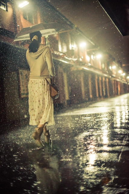
Although now living in UK, Charlie had been in Tokyo for many years and doing street photography. That’s about all I know about him, the rest is guess. A strongly opinionated person I’d dare to assume.

I can only recommend you to have a look at his work (on Burn My Eyeon Tumblr, not on Flickr anymore; note it can be NSFW). His style is remarkable, using flash to take street portraits in an intrusive, aggressive manner. Some of his shots are truly fascinating. In the interview, he explains how he took what would become his single most famous shot.

The point of this post was only to mention that interview, but while I’m at it, here is a documentary by Adrian Storey. There’s even a TL;DR version, ahem, trailer.

At last underneath his portrait of Charlie Kirk, Jason Comb also writes:

Everywhere and especially in Tokyo people put on a mask of sorts to project an image of how they want people to see them. Charlie’s work is as if he pulls off that mask, then captures what’s under that mask to reveal something more interesting. Of course this isn’t for everyone and some people don’t like it, but in a sea of mediocrity and many relying on post production to make their photos interesting Charlie is a breath of fresh air.

Readings on color management

Color management in the production pipeline is a tough topic. A really tough one. And a crucial one too. Unfortunately not only is this an important and difficult topic, but it also seems to me that except maybe for people working on AAA games or heavy budget film industry, most have little knowledge on the matter, when they’re not just completely unaware of the issue.

The issue that image capturing devices, screens and printers all have different color characteristics (said simply: what you scan, photography or film will not look the same depending on the capturing device used, and a same image will look different depending on the display or printing device too).

The issue that they have a capturing or display range usually far from what the human vision is capable of, and by “far” you must understand by orders of magnitude (said simply, the average human can perceive way more contrast than a camera is able to capture, differentiate much more colors than a screen is able to display, and on top of that there are colors an average screen is just absolutely unable to render, like the orange of your fluorescent highlighter for example; this one is my favorite example actually :) ).

The issue that screens and image formats use a non linear representation leading to severe errors in colors unless it is taken into account when manipulating images (said simply, ignore gamma correction in your rendering and your lighting will be wrong, ignore it when you resize images and they will look wrong too).

I just wish it were more simple and “just worked”. But until then we have to deal with it. So here goes the list of readings on this nonetheless very interesting topic.

On color management:

On gamma correction:

  • Gamma error in picture scaling: this article shows how bad things can go when image manipulation softwares don’t take gamma into account, and gives a glimpse of how widespread the problem is.
  • The Value Of Gamma Compression: I like this short article a lot, as it shows in a quick a clear way how a bad gamma management can ruin a rendering.
  • Gamma and Lighting Part 1, Part 2, Part 3: this three parts article from the same blog explains how they handle the issue in the production pipeline of X-Plane.
  • GPU Gems 3, Chapter 24 – The Importance of Being Linear: this article explains how to take gamma into account in your rendering pipeline; while an interesting read, I think it doesn’t make the issue obvious enough (as I find the different illustrations to be equally bad looking).
  • Gamma FAQ: this FAQ is quite dated but still helps understanding the origin of gamma correction and avoid confusion between various concepts (there is also a Color FAQ from the same author).

Update: this 4mn video explains quite convincingly the need for gamma correction.

On tone mapping:

Have a good read!

Update: this lengthy presentation of GDC 2010 (quoting: “The presentation is basically four 20 minute presentations crammed into 55 minutes.”), by John Hable, covers several of these topics.

Noah takes a photo of himself every day for 12.5 years

Noah Kalina has been taking a self portrait every day for over twelve years, and uploaded yesterday on Youtube a new time-lapse video of this work in progress. There are a couple of such videos on Internet, but this one is the longest time span I am aware of. During seven minutes, you can not only see how his face evolves as he ages, but also get a glimpse of his outfit style as well as his professional and personals lives.

TED talk about femto photography

I already mentioned the camera built by a team in the MIT Media Lab, allowing with its trillions of frame per second, to capture the propagation of light or to see around corners.

TED published a video of the talk given by Ramesh Raskar, where he presents this work and the new possibilities it opens.

An image in the rain

A typhoon passed over Japan a couple of days ago, causing, at least in Tokyo, no more trouble than some serious rain and a couple of broken umbrellas. It was also an opportunity for photographers to catch some interesting scenes. This image in particular grabbed – as in, took and refused to give back – my attention.

Vertical version - 90度回転

With the kind permission of its author, Héctor García (aka. kirai / kirainet)

A real gem.

I have to disagree with the author when he argues the result is marred by the unbalanced composition (see the description on the Flickr page). I think on the contrary it makes the scene more vivid, more intense and in a sense, more fragile, bringing back the movement and life the high shutter speed froze away. It would have been so less interesting if it was perfectly aligned and balanced.

On a side note, also notice how the lines draw the attention on the model as the vanishing point is out of the frame. If it was within it, the feeling would be very different as the attention would drift toward the end of the street.

Last but not least, look at this light! Look at the warm reflections, the rim on the arm, the scattering through the drops…

This is exactly the sort of light I was referring to when I chose the title of this blog.

Update: Kirai made the following video out of some of the shots taken during that session.