Insanely Twisted Shadow Planet is a 2D shooter with an outstanding visual style (and this is where my description ends since I am yet to try this game, even though I already bought it). In this 10mn video, Ryan Meyer explains how the camera system he wrote for the game works.
Category Archives: Design
Bret Victor – Seeing Space
Following on his previous talks on data visualization and programming interfaces, Bret Victor presents the idea of what he calls a “seeing space”, meant to improve understanding of problems in the context of collaborative engineering.
Seeing Spaces from Bret Victor on Vimeo.
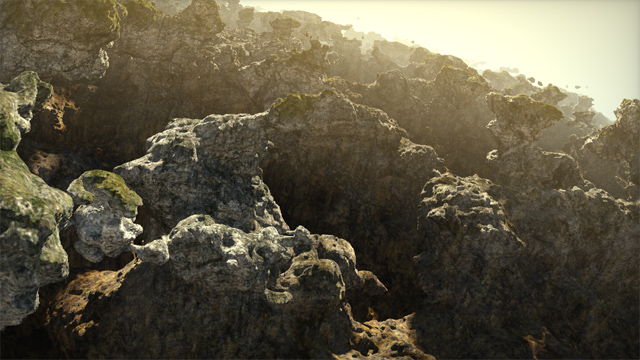
Simple light setup for outdoor environments
On his website, Iñigo Quilez (known for a wide range of notable contributions at RGBA, BeautyPi and Pixar; talk about an over-achiever! but I digress already), recently described the light setup he often uses for outdoor environments.
From the article:
This articles describes the lighting rig I use when doing such tiny computer graphics experiments with landscapes. It’s basically made of 3 or 4 directional lights, one shadow, some (fake or screen space) ambient occlusion, and a fog layer. These few elements tend to behave nicely and even look fotoreal-ish if balanced properly.
Setting up lights is not an easy task, so this article is a very welcomed insight. I especially like the trick of using an opposite directional light to fake global illumination. I also very much agree on using actual fill lights. Constant ambient alone is not enough, as you lose any sense of volume in the shadowed parts.
I am not too fond of the shadow penumbra trick though, which he described previously already. I must admit it indeed gives a warm look, but it doesn’t make any physical sense. So I suspect this should rather belong to the tone mapping part of the rendering, just like the square root he used to apply to the diffuse fall-off really was really working around the lack of gamma correction.
The recommendation to keep albedo near 0.2 is an interesting one. Indeed, your typical rock and grass albedo is nowhere near the albedo of snow (a quick look at Wikipedia gives this comparison chart). But if it is stored in a texture in a typical rendering pipeline, the question of precision lingers. I wonder how big game studios typically address this.
Lettering: making of a cover artwork
This video shows the process of making a lettering artwork by designer and calligrapher Frank Ortmann.
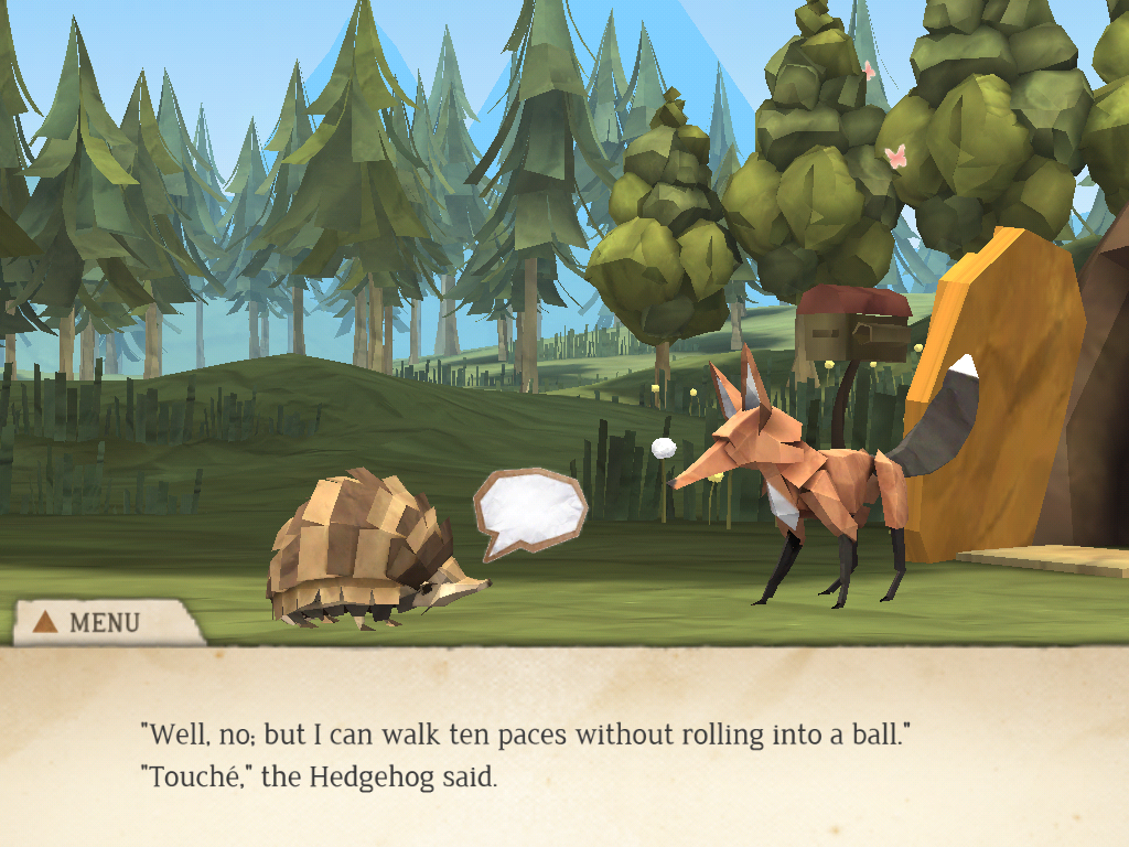
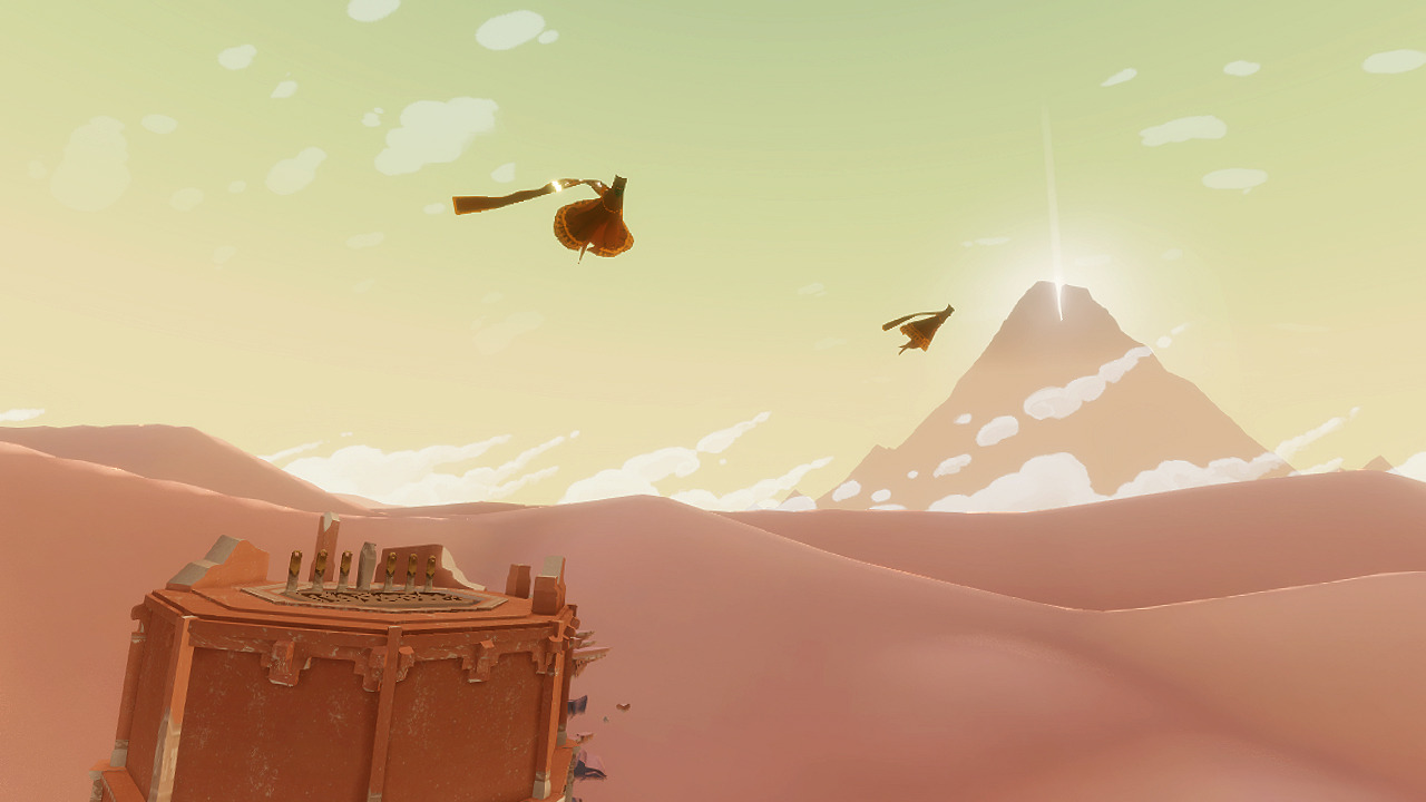
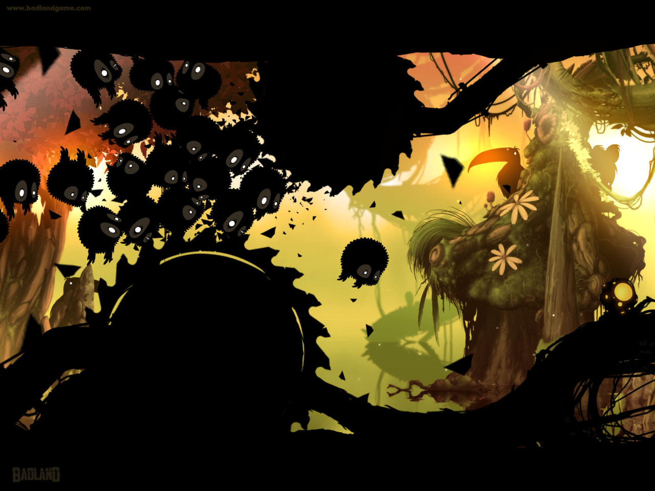
Video Game Art Styles
Here is a Tumblr blog someone mentioned yesterday on Twitter, that collects screenshots from various games (mostly indy, but triple A as well), thus giving a glimpse of various visual styles.
Math:Rules – Strange Attractors
This artist created a series of posters beautifully showcasing various strange attractors. The author also gives some explanations and links to tutorials on the topic.
Tokyo City Symphony: a video mapping on a model of Tokyo
I was impressed by the quality of this work. The model looks very accurate, the soundtrack captures the sound environment one experiences in Tokyo, and the video mapping comes with some nice ideas.
The project seems to allow even more than is shown on the video, with some interactive mapping: see the Tokyo City Symphony website.


