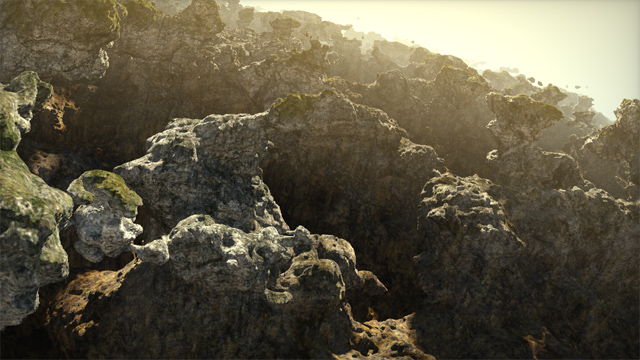
On his website, Iñigo Quilez (known for a wide range of notable contributions at RGBA, BeautyPi and Pixar; talk about an over-achiever! but I digress already), recently described the light setup he often uses for outdoor environments.

Capture of his technique in action
From the article:
This articles describes the lighting rig I use when doing such tiny computer graphics experiments with landscapes. It’s basically made of 3 or 4 directional lights, one shadow, some (fake or screen space) ambient occlusion, and a fog layer. These few elements tend to behave nicely and even look fotoreal-ish if balanced properly.
Setting up lights is not an easy task, so this article is a very welcomed insight. I especially like the trick of using an opposite directional light to fake global illumination. I also very much agree on using actual fill lights. Constant ambient alone is not enough, as you lose any sense of volume in the shadowed parts.
I am not too fond of the shadow penumbra trick though, which he described previously already. I must admit it indeed gives a warm look, but it doesn’t make any physical sense. So I suspect this should rather belong to the tone mapping part of the rendering, just like the square root he used to apply to the diffuse fall-off really was really working around the lack of gamma correction.
The recommendation to keep albedo near 0.2 is an interesting one. Indeed, your typical rock and grass albedo is nowhere near the albedo of snow (a quick look at Wikipedia gives this comparison chart). But if it is stored in a texture in a typical rendering pipeline, the question of precision lingers. I wonder how big game studios typically address this.

