Watch Dogs

Ubisoft made an impression at E3 by unveiling this video of its upcoming game, Watch Dogs. The mood definitely reminds the original Deus Ex.

Although I am not a fan of violent games, I like the effort put to make it not only look, but feel real: in particular the scene of the random guy trying to get his girlfriend to talk to him after getting shot is quite strong and disturbing.

On the rendering side, there is a lot to notice. Many materials completely nail it (look at that leather coat!), and the faces look really good, especially when back lit.

Is tiled forward rendering the new hot thing?

I see more and more people talking about tiled forward rendering, and it seems to be the new hot thing everyone wants to try. AMD recently released a tech demo using such a technique: Leo.

Aras Pranckevičius, rendering architect at Unity, discussed modern forward rendering in an article, 2012 Theory for Forward Rendering, and later dropped a bunch of Tiled Forward Shading Links (which I won’t duplicate here so just click). Wolfgang Engel argues tiled based approaches don’t pay back when many lights cast shadows, compared to deferred lighting. At last Brian Keris discusses Tiled Light Culling, for the diffuse and specular contributions.

Toward physically based rendering, screenshot after screenshot

Here are the screenshots I made for the talk I previously mentioned. They show how the rendering evolves through the choice of shading. The setup consist of a close yellowish punctual light on the up right, and a distant red-ish punctual light on the back left, as well as a dim blue ambient. The objects only differ by the specular exponent, which jumps by a times two factor from one object to the next one, left to right.
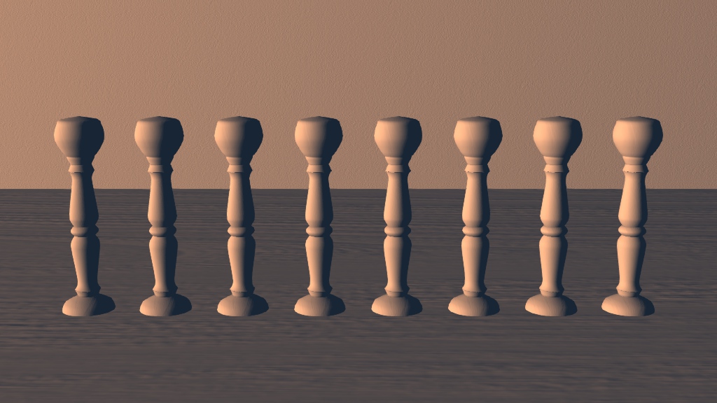
One light, Lambert diffuse only.
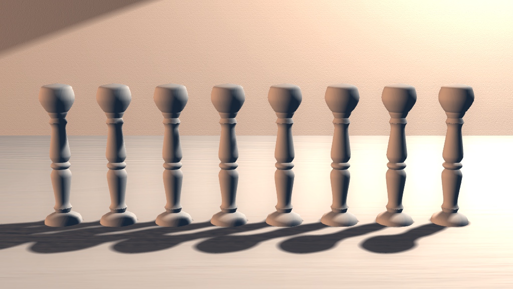
Two lights, Lambert diffuse only, with variance shadow map.
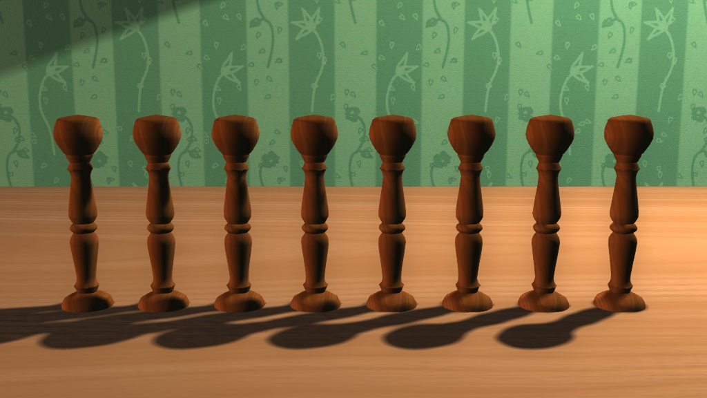
Two lights, Lambert diffuse only, with albedo.
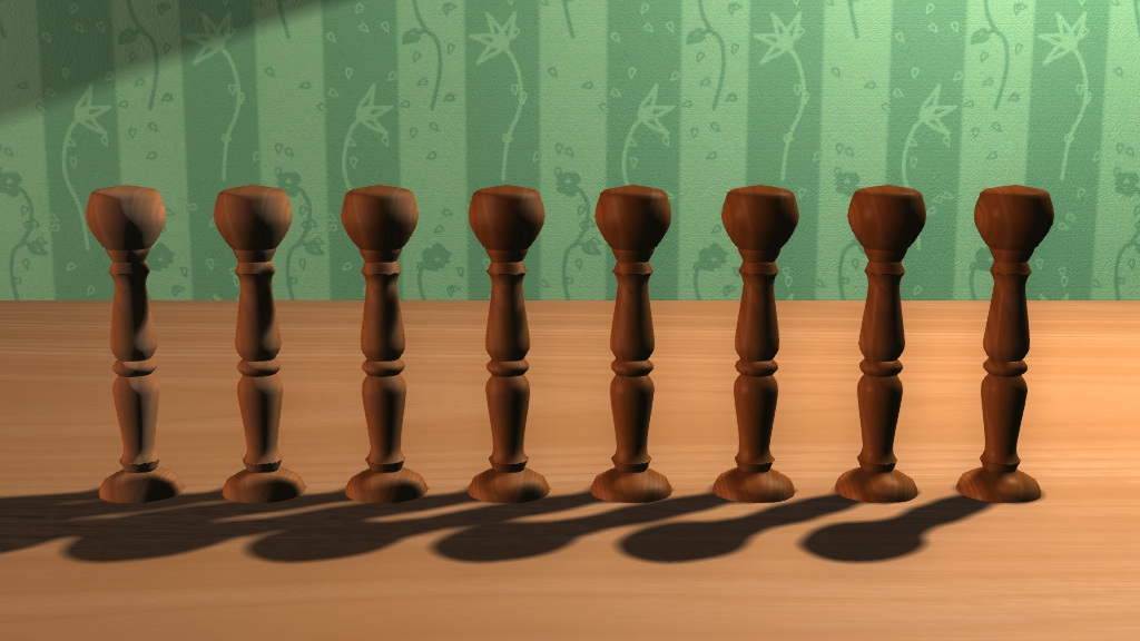
Two lights, diffuse and Phong specular. Notice the color on the left.

One light, Phong specular only. Notice the discontinuity on the left.
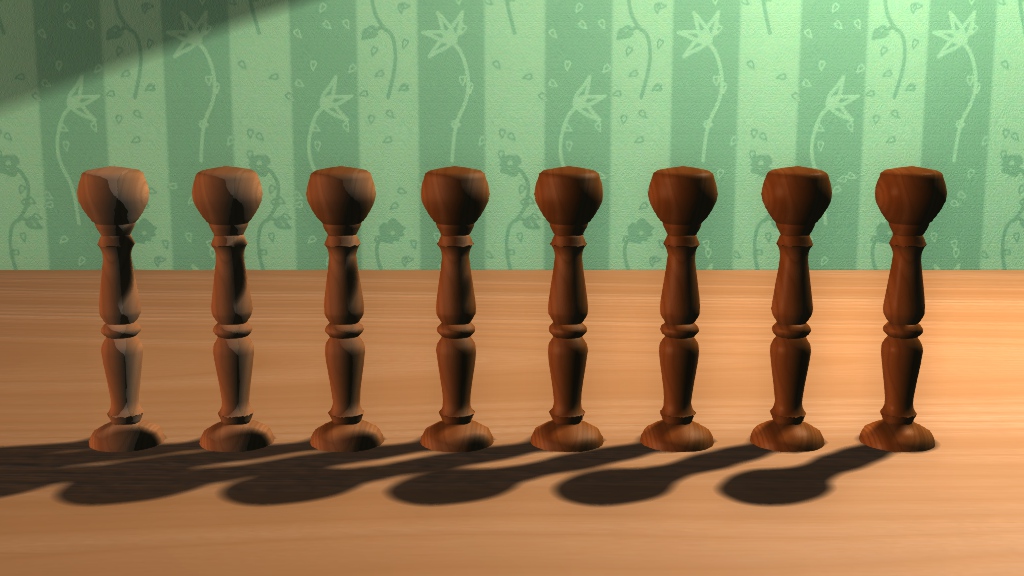
Two lights, diffuse and Blinn-Phong specular.

One light, Blinn-Phong specular only. Notice the absence of discontinuity.
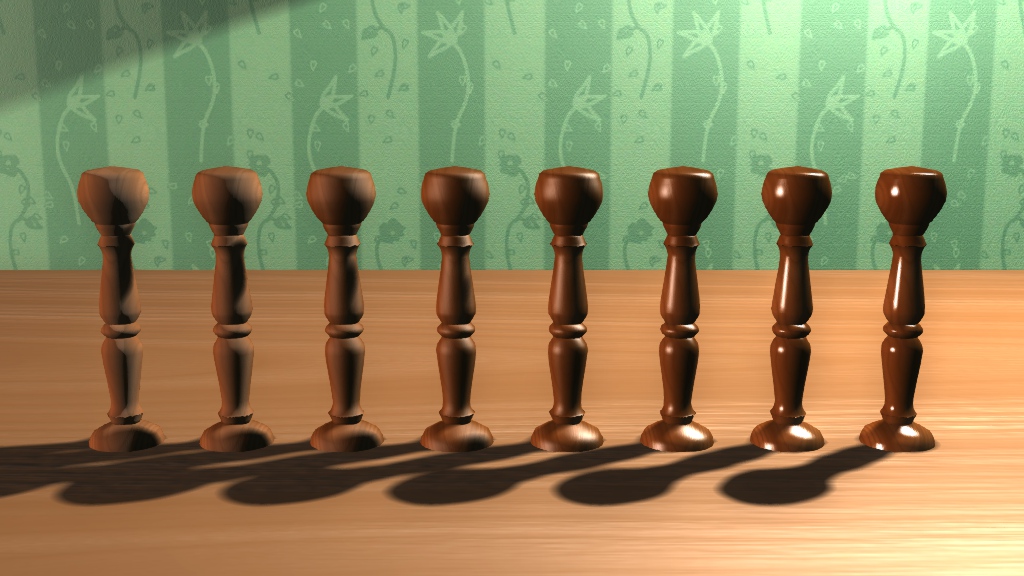
Two lights, diffuse and normalized Phong specular. Notice the highlight intensity.
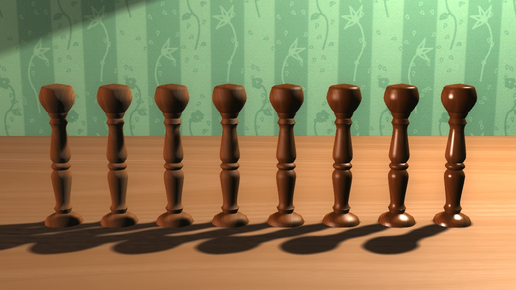
Two lights, diffuse and normalized Blinn-Phong specular.
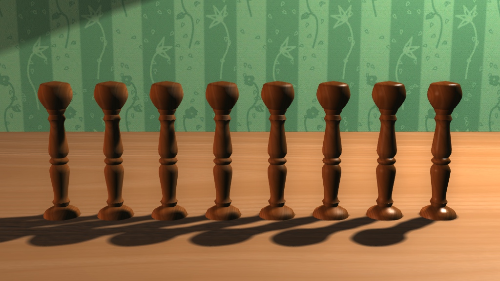
Two lights, diffuse and normalized Blinn-Phong specular, Fresnel term with Schlick
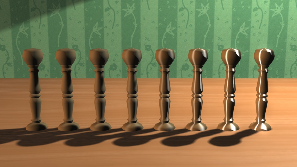
Two lights, Heidrich-Seidel anisotropic specular.

Next steps: getting used to the Fresnel version, experimenting with the exponent as a texture lookup, and normalizing the Heidrich-Seibel specular.

Introduction to light shading for real-time rendering

I am finally back in Tokyo after two intense weeks in Europe, during which I did things as various as being a perfect tourist in four capitals (stolen bag experience included) or attending the world biggest demoparty, getting nominated with the rest of my group for some awards, ranking 2nd in a competition and getting slashdotted for that. :)

As previously advertised, I presented at Revision a talk on light shading. A video was recorded for the streaming and has been made available online pretty much immediately, thanks to the work of the Revision team:

Unfortunately, the last minutes are missing. I was basically comparing the Fresnel version with the manually tweaked version, and explaining that while the former might not look perfect yet, it was an out of the box result, while the latter required me to introduce some fudge factor I had to tweak. Regarding references, I couldn’t list them all so I just mentioned the most significant ones (the first part of this talk is strongly inspired by Naty Hoffmann’s course introduction) and referred to here for the rest. At last I mentioned an evaluation sheet for whoever cared to give some feedback.

Performance wise, when seeing the video I feel embarrassed. The flow is far from what I was aiming, some explanations are not crystal clear as I wanted them to be, and you can notice I was confused a couple of times by the surrounding noise (hey, did I mention it’s a party?). But on the other hand various people told me it was a good seminar so even though there is much room for improvement, it’s not that bad of a start I guess.

Anyway, you can download a quick export of the party version of the slides. When I have some time I will try to get a better looking export (without text and images cropped out), and fix a couple of slides.