Practical Pigment Mixing for Digital Painting

About a year ago at SIGGRAPH Asia 2021 (which took place as a hybrid conference both online and on site at the Tokyo International Forum) one of the technical papers that caught my attention was the publication by Šárka Sochorová and Ondřej Jamriška on color mixing.

Color mixing in most digital painting tools is infamously unsatisfying, often limited to a linear interpolation in RBG space, resulting in unpleasing gradients very different from what one would expect. Ten years ago I mentioned this article that presented the color mixing of the application Paper, which tried to solve this very problem.

This time, the core idea is to model colors as pigments: estimate the pigment concentration based on the color, so in a way, move from RGB space to “pigment space”, and interpolate the pigment concentration, before converting back to RGB space.

The paper uses the Kubelka-Munk model for estimating colors from pigment concentration. The problem however is to find a transformation between the two spaces. A first assumption is made on the available pigments: essentially restricting them to CMYK. Then two problems are addressed: RGB colors that cannot be represented with those pigments, and likewise pigment colors that cannot be represented in RGB.
The paper proposes a remapping that enables a transform and its inverse, thus allowing to move from RGB space to pigment space, interpolate in pigment space, and move back to RGB space.

You could argue this is therefore a physically based diffuse color mixing.

Finally, the implementation of the proposed model, Mixbox, is available under a CC BY-NC license:
https://github.com/scrtwpns/mixbox

Two Minute Papers did a video on this paper as well:

https://youtube.com/watch?v=b2D_5G_npVI

Building an artificial window

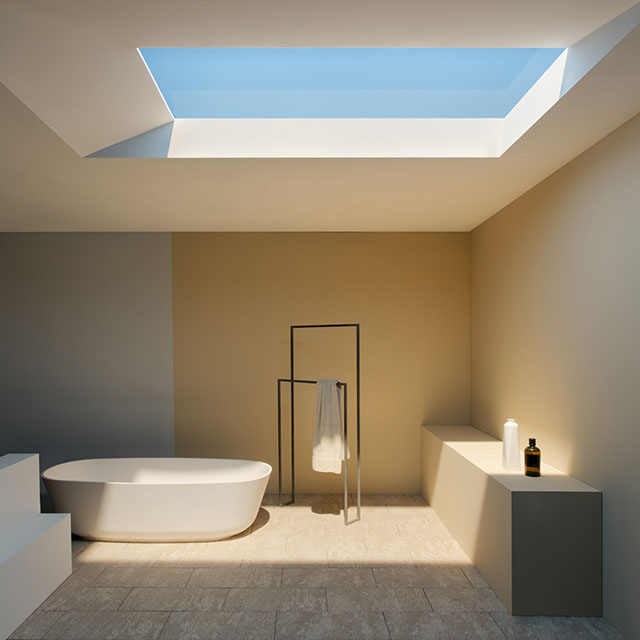
Several years ago, I mentioned the Italian company CoeLux, which specializes in making artificial windows: light fixtures that look like sunlight in a clear blue sky.

The price of their products is apparently in the range of several tens of thousands of dollars (I’ve heard prices like $20k to 50k), which makes it out of reach for most individuals. Not many details about their invention are available either (from the promotion material: LED powered, several hundred watts of electrical power, a solid diffuse material, and a thickness around 1 meter), and I was left wondering what was the secret sauce to their intriguing technology.

The window in this photo is in fact an electrical light fixture.

The YouTube channel DIY Perks has been working on day light projects for a while now, improving at each iteration. Yesterday they published a video explaining how to build a light that seems to give very similar results as CoeLux’s product, from some basic materials that are fairly simple to find. Since their solution takes roughly the same volume, it’s tempting to think it uses the same technique

It’s extremely satisfying to finally see how this works and, despite the practical aspects, quite tempting to try if only to see how it looks in real life.

The Chemical Brothers: “Wide Open”

Earlier this year at Tokyo Demo Fest 2016, we were honored with the presence of Solid Angle‘s founder, Marcos Fajardo, who did a long presentation of the Arnold renderer. Various examples of productions that involved Arnold were included, like captures from Iron Man or Elysium, but between those blockbusters one production in particular held my attention.

It was a long shot of a dancer turning limb after limb into a lattice body while performing. That film is in fact the music video of the song “Wide Open”, by the Chemical Brothers, and directed by Dom&Nic. It is a brilliant piece of technical and artistic work, that I can only recommend to watch.

Some of the details of the creation are shared in an article by the excellent fxguide, as well as in this interview for Solid Angle, like for example how they dealt with the challenges posed by a single long shot under varying natural light. Finally, there is this behind the scenes video from the studio, The Mill:

Metal materials study

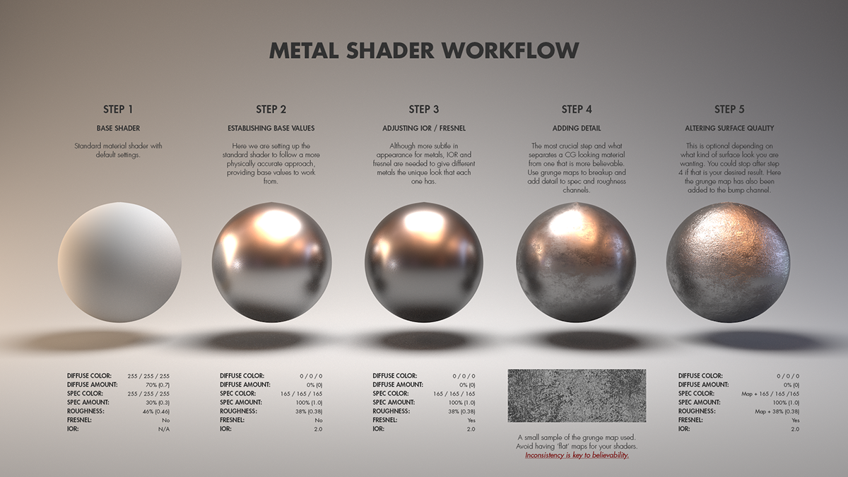
Texture artist Jarrod Hasenjager posted a page of various metal materials study: aluminum, brass, bronze, chrome, copper, gold, iron, lead and steel, and rusted steel and iron. According to the description, the renders are done in Houdini, and the look is driven by artistic taste and personal experience rather than from physical values.

Users don’t read error messages

My CHI professor used to repeat that users didn’t read error messages, and that you should avoid them when possible. Think about it: how often do you close error messages without even reading whatever is written? And when you do read them, how often do you find them both clear and relevant?

I was recently shown this picture (source unknown unfortunately; adapted from these ones) of a slide that captures perfectly the problem with most error dialogs.

Every error message

Every error message.

Facebook’s iOS Infrastructure

In this talk from @Scale 2014, Adam Ernst and Ari Grant present some of the problems met during the development of the native Facebook mobile application, and the solutions developed.

The first part, starting at around 7’00, explains why the built-in data management library was ill-suited and how they designed a different system to better suit their needs. The second part, starting at around 24’30, shows how their implementation of MVC was becoming unmanageable and how they redesigned it. Interestingly enough, in both cases the solution was based on immutability.

An artificial light that looks like light from the sky

http://www.coelux.com/

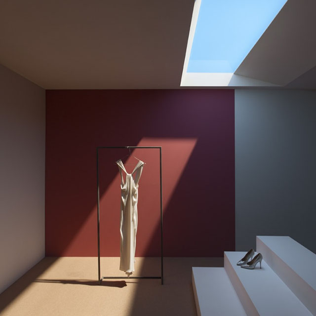
The Italian company CoeLux has apparently managed to create an artificial light which uses a material that mimics the atmospheric scattering, to look like sunlight and light from the sky. Judging from the photos and videos available on their website, it seems the look is very convincing.

As they point out, this could have a serious impact on architecture, as available sunlight is a factor in the design of buildings. Unfortunately, at this stage it is a prohibitively expensive product for the average consumer, and likely targeted at the construction industry. But it might be only a niche for some years before expanding to a larger scale.

The news websites PetaPixel and Colossal have previously covered this topic last month, and included some larger product photos made available by the company. But the most interesting coverage might be the one by Lux Review, who met CoeLux at an exhibition booth and made the following video. From their article:

No, the light source doesn’t move… yet. No, the colour temperature isn’t dynamic… yet. The void height needed is a metre. It consumes 340W of electrical power, but that will come down as LEDs improve.


Update: a YouTube channel presented a way to build such an artificial window at home. See: Building an artificial window.