Color Scheme Designer is a tool I have been for a while now, but more recently I discovered Color Sphere. Both are very helpful when it comes to choosing an harmonious set of colors. Color Scheme Designer gives much more control over colors repartition and has more export options, while Color Sphere has more rules and a simpler interface. Both allow to test the color set against various kinds of color blindness.
Category Archives: Design
How to use light to make better demos?
This is the third day at Revision, and my contribution this year is the talk I gave yesterday. Unlike last year, this seminar is not technical at all but focused on the design aspect and, to some extent, how it relates to the technical one. The context is demomaking, but many ideas are still valid in other media.
There were some issues with the recording unfortunately, which means some elements are missing (you will notice some blanks at the beginning). In particular after 5mn, there is an important point which was completely cut out. The text was:
Throwing a new technique at whatever you’re doing is not going to make it any better. It’s only going to change what you can achieve. There are two sides of image creation: the technical one and the artistic one. Different techniques allow to do different things, and the more techniques you master, the better you understand what you can and cannot do with them, and how to do it. Technique becomes a tool that changes how you can express yourself.
Here are the slides with notes (~5MB), or a low quality version (~1MB).
For more demoscene related talks, here is the full list of seminars at Revision 2013.
Talking about light at Revision, 2
Last year I gave a talk at Revision in which I summed up some of the things I had been gathering on light shading.
This year too I will be attending Revision, in Saarbrücken, Germany, and will give a talk about light again. I will present some of the new stuff I learned. This time the topic is going to be focused on the use of light from a design perspective, in particular in the context of demo-making. It will also be an opportunity to improve on the things I wasn’t happy with regarding the performance: hopefully a better diction, flow and construction.
The talk is scheduled for Saturday, March 30th, at 12:00: “How to use light to make better demos?”. Please come and don’t bring tomatoes. :)
Also make sure to have a look to the complete list of talks, there is a lot of exciting stuff scheduled.
Article on the color mixing tool of Paper for iPad
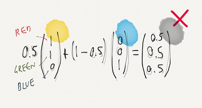
Paper is a drawing application made by FiftyThree for the iPad, that has earned some attention. FastCompany has a story on what seems to be the central tool of Paper: The Magical Tech Behind Paper For iPad’s Color-Mixing Perfection.
The article follows the authors on their thought process, from the starting observation that linear interpolation in RGB space leads to unpleasing results, to experiments and eventually, the final tool.
(Illustration with the kind permission from Chris Dannen)
Street Pong
This project idea is excellent on so many levels… Too bad it’s only a simulation.
More information on the Vimeo page.
Video mapping blog
The Video Mapping Blog references various examples of video projection mapping, done at any scale.
Secret Garden – Versailles
A friend of mine pointed out this Dior video and it certainly caught my attention. Playing with black and white or color images, natural or artificial light, indoor or outdoor scenes, it presents three models wandering in the Galerie des Glaces and the gardens of the Château de Versailles.
As usual with world class fashion material, the image is absolutely flawless: you can pause the video at pretty much any moment and get a picture that is perfect. The montage is synchronized with the Depeche Mode song, Enjoy the Silence, and I would be curious to hearing the underlying idea that led the direction.

