My CHI professor used to repeat that users didn’t read error messages, and that you should avoid them when possible. Think about it: how often do you close error messages without even reading whatever is written? And when you do read them, how often do you find them both clear and relevant?
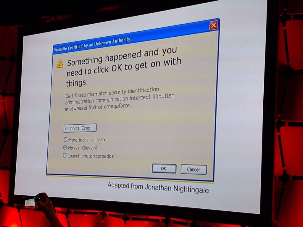
I was recently shown this picture (source unknown unfortunately; adapted from these ones) of a slide that captures perfectly the problem with most error dialogs.

Every error message.
